If you look at most interactive visualizations that involve something like D3, you tend to see lots of circles, bars, and lines. There are several reasons for this. First, presenting information simply and cleanly is optimal to communicate an idea. If you show me a box plot that uses different tellitubbies as misshapen bars, I am likely going to be confused, a little angry, and miss the data lost in all the tubby. Second, basic shapes are the default available kind of icon built into these technologies, and any variability from that takes extra work.
Could there be value in custom components?
This begs the question - if we were able to, would the world of data science specific to generating interactive visuaizations be improved with custom components? I imagine the answer to this question is (as usual), “It depends.” The other kind of common feature you see in something like D3 is a map. The simple existence of a map, and an ability to plot information on it, adds substantially to our ability to communicate something meaningful about a pattern across geographical regions. The human mind is more quick to understand something with geographic salience overlaid on a map than the same information provided in some kind of chart with labels corresponding to geographic regions. Thus, I see no reason that we cannot have other simple components for visualizations that take advantage of our familiarity that brings some intuitive understanding of a domain or space.
A Bodymap
My first idea (still under development) was to develop a simple map for the human body. I can think of so many domains crossing medicine, social media, and general science that have a bodygraphic salience. I was in a meeting with radiologists many weeks ago, and I found it surprising that there weren’t standard templates for an entire body (we have them for brain imaging). A standard template for a body in the context of radiology is a much different goal than one for a visualization, but the same reality rings true. I decided that a simple approach would be to take a simple representation, transform it into a bunch of tiny points, and then annotate different sets of points with different labels (classes). The labels can then be selected dynamically with any kind of web technology (d3, javascript, jquery, etc.) to support an interactive visualization. For example, we could parse a set of documents, extract mentions of body parts, and then use the Bodymap like a heatmap to show the prevalance of the different terms.
Generating an svg pointilism from any png image
My first task was to be able to take any png image and turn it into a set of points. I first stupidly opened up Inkscape and figured out how to use the clone tool to generate a bunch of points. Thankfully I realized quickly that before I made my BodyMap tool, I needed general functions for working with images and svg. I am in the process of creating svgtools for this exact goal! For example, with this package you can transform a png image into an svg (pointilism thing) with one function:
from svgtools.generate import create_pointilism_svg

# Select your png image!
png_image = "data/body.png"

# uid_base will be the id of the svg
# sample rate determines the space between points (larger --> more space)

create_pointilism_svg(png_image,uid_base="bodymap",
                                sample_rate=8,width=330,height=800,
                                output_file="data/bodymap.svg")
I expect to be adding a lot of different (both manual and automated) methods here for making components, so keep watch of the package if interested.
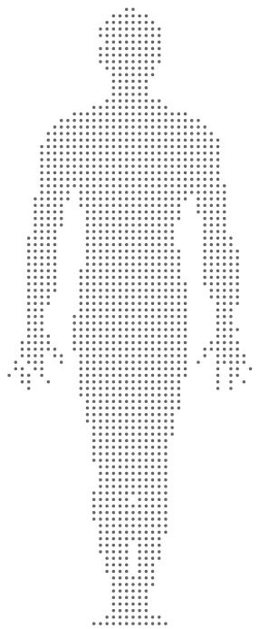
This allowed me to transform this png image:

into a “pointilism svg” (this is for a sampling rate of 8, meaning that I add more space between the points)
Great! Now I need some way to label the paths with body regions, so I can build stuff. How to do that?
Terms and relationships embedded in components
We want to be able to (manually and automatically) annotate svg components with terms. This is related to a general idea that I like to think about - how can we embed data structures in visualizations themselves? An svg object (a support vector graphic) is in fact just an XML document, which is also a data structure for holding (you guessed it, data!). Thus, if we take a set of standard terms and relationships between them (i.e., an ontology), we can represent the terms as labels in an image, and the relationships by the relationship between the objects (eg, “eye” is “part of” the “head” is represented by way of the eye literally being a part of the head!). My first task, then, was to take terms from the Foundation Model of Anatomy (FMA) and use them as tags for my BodyMap.
A little note about ontologies - they are usually intended for a very specific purpose. For example, the FMA needs to be detailed enough for use in science and medicine. However, if I’m extracting “body terms” from places like Twitter or general prose, I can tell you with almost certainty that you might find a term like “calf” but probably not “gastrocnemius.” My first task was to come up with a (very simple) list of terms from the FMA that I thought would be likely to be seen in general conversation or places like the Twitterverse. It’s not an all-encompassing set, but it’s a reasonable start.
Annotation of the BodyMap
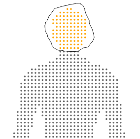
I then had my svg for annotation, and I had my terms, how to do the annotation? I built myself a small interface for this goal exactly. You load your svg images and labels, and then draw circles around points you want to select, for example here I have selected the head:
and then you can select terms from your vocabulary:
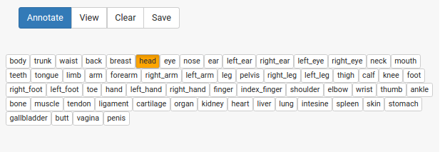
and click annotate! The selection changes to indicate that the annotation has been done.
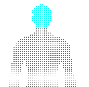
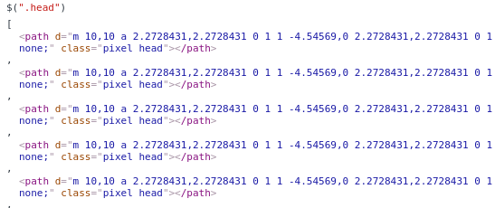
Selecting a term and clicking “view” will highlight the annotation, in case you want to see it again. When you are finished, you can save the svg, and see that the annotation is present for the selected paths via an added class attribute:
This is the simple functionality that I desired for this first round, and I imagine I’ll add other things as I need them. And again, ideally we will have automated methods to achieve these things in the long run, and we would also want to be able to take common data structures and images, convert them seamlessly into interactive components, and maybe even have a database for users to choose from. Imagine if we had a database of standard components for use, we could use them as features to describe visualizations, and get a sense of what the visualization is representing by looking at it statically. We could use methods from image processing and computer vision to generate annotated components automatically, and blur the line between what is data and what is visual. Since this is under development and my first go, I’ll just start by doing this annotation myself. I just created the svgtools package and this interface today, so stay tuned for more updates!
Suggested Citation:
Sochat, Vanessa. "Interactive Components for Visualizations." @vsoch (blog), 19 May 2016, https://vsoch.github.io/2016/svgtools/ (accessed 16 Apr 24).