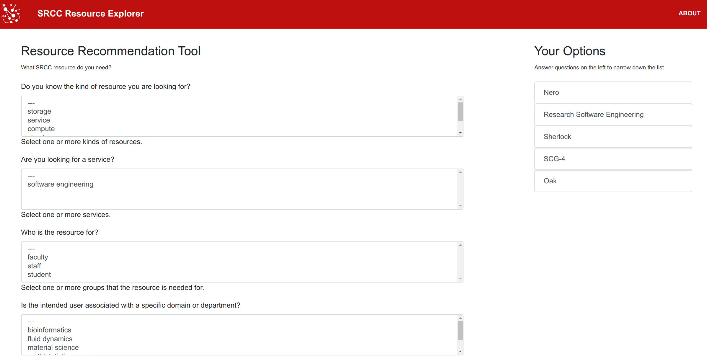
Just about a year ago I created and wrote about the resource explorer, the idea being an interface that shows some set of options, and then allows the user to filter down to what they might be looking for. That looked like this:
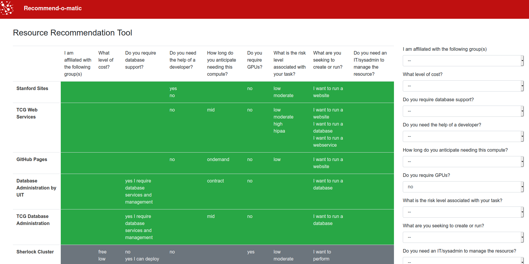
As a result of that work, I was asked for help with a prototype for a more tabular version, something called the “Recommend-o-matic” that would show resources in a table, and filter down to potential options. The tool would be developed in an open source fashion on GitHub, and since there are many folks out there that also provide resources that might warrant such a tool, I wanted to share it sooner than later. Open source for the win! I threw this together at the end of this last week, and have a prototype!
Continue reading for more background about the tool or jump into the documentation for complete details for generation and usage.
How does it work?
We start with spreadsheets, validate and generate data for the interface, and then deploy the interface.
Spreadsheets
We start with tab separated spreadsheets for resources and questions. These can be collaborated on in Google Sheets, or just generated locally. Examples (exported from Google Sheets) are provided. The sheets must follow a specific format, which is eventually validated. For example, we define a list of questions and valid options, and then each resource must have a column for each question id, with one or more valid answer.
Validation and Generation
A script recommend-o-matic.py validates the sheet exports and generates data (json) for the interface. Given a spreadsheet that could be available via a URL and a script to generate the data, you might guess that it would be fairly easy to automate generation (e.g., downloading an updated Google Sheet, validating and generating the data, and pushing to an update interface) and you are spot on! I designed the workflow to be (eventually) entirely programmatic.
Interactive Table
Once the data is generated, you likely want to customize some options to customize the interface. Of course you can also customize the style provided directly with the tool - I’m definitely not a web designer and I expect much more talented folks to clean up my simple work. By following the instructions for deployment, A Vue.js component paired with stylesheets generates the interactive table. This was my first component with an embedded template, so I was pretty stoked.
How is it different?
The main goal of the recommend-o-matic is to provide transparency. This means no filter logic that hides choices from you, and no obscure page elements that hide information. Whenever I’ve chat with folks about creating this kind of tool, their mind quickly goes to generating logic in a tree, and asking questions that determines branching logic. We don’t want that, and actually, we never want to hide anything from the user. We instead want to show a complete table of options, and for each, a set of features. We want the user to easily be able to answer questions on the right, and see how their choices change. For example, let’s say that you select that you absolutely must have a certain cost level, but then you see that a choice of a solution that you liked goes away. Maybe you might be a little more flexible to cost? Mind you this is a dummy prototype and our input data is somewhat limited (or should I say, needs a little love!) but the general idea is there.
What needs love?
I created this interface in an afternoon (and am writing about it today) so there are (expectedly) many changes or features I’d like to see. Even the input data (questions and resources) are fairly rough. I didn’t want to go too far without getting input from colleages, and I’m hoping they think it’s at least a good start. The following features or changes I think would improve the tool:
GitHub Workflow
Automation is king! It would be fairly easy to create a workflow to download a set of sheets, validate and generate updated data, and then deploy an updated interface. I will very likely be doing this for a more updated version, and heck, it could even be a GitHub Action. Right now, the branding is fairly up to the user, which makes sense, but for a GitHub Action I’d likely provide an even simpler “vanilla” template that removes the current branding I have.
Sorting
Currently, rows (resources) are not sortable, but they could be (based on group or category, which I’ve already added to the data). This would be hugely useful if instead of applying a filter for something like cost, the user could sort by something like cost.
Sizing
I had an original vertical design with the choices on the top, but wasn’t happy that it pushed the table out of view. I adjusted the choices to be alongside the table instead, and am much happier. However, the table still feels like it takes up too much space. I’d like to have a more condensed table that is easier to visually parse.
Labels
An additional level of labels (also based on group or category) could be used to help visually group components.
Organization of Links and Metadata
Currently, resource names link to the resource page, and a description appears at the bottom on mouseover of the row. This obviously could be refactored to use some other “show the user metadata” option. It might also be useful to have a promient “Get Help” somewhere on the page.
Empty Values
Currently, leaving a field blank in the list of resources indicates “I don’t care” and it has no effect on the filter. However, seeing an entire row of empty values can be confusing (e.g., the server option). So instead it might make sense to replace empty cells with “any” to make this more obvious to the user.
Conclusion
Vue.js continues to be my favorite little front end framework for the rare times that I need one. If you haven’t ever tried it, I encourage you to give it a shot, and know that it’s okay to not be great when you start. I’m still fairly terrible, but each time I create something I feel a tiny percentage better. Aside from that, that’s all folks! Since this will get a lot of feedback, I expect it to change in the coming weeks. In the meantime, if you have ideas or feedback, don’t hesitate to open an issue!
Suggested Citation:
Sochat, Vanessa. "The Recommend-o-matic." @vsoch (blog), 10 Oct 2020, https://vsoch.github.io/2020/recommend-o-matic/ (accessed 02 Apr 26).

