Reproducibility of an analysis means having total transparency about the methods, and sharing of data so that it can be replicated by other scientists. While it used to be acceptable to detail a method in a manuscript, modern technology demands that we do better than that. Today coincides with the publication of the MyConnectome Project, a multi-year endeavour by Russ Poldrack to collect longitudinal behavioral, brain imaging, and genomics data to do the first comprehensive phenotyping of a single human including imaging data. Russ came to Stanford in the Fall of 2014 when I started working with (and eventually joined) Poldracklab, at which point the data acquisition had finished, analyses were being finished up, and we were presented with the larger problem of packaging this entire thing up for someone else to run. We came up with the MyConnectome Results web interface, and completely reproducible pipeline that will be the topic for this post. Russ has written about this process, and I’d like to supplement those ideas with more detail about the development of the virtual machine itself.
What is a reproducible analysis?
From a development standpoint, we want intelligent tools that make it easy to package an entire workflow into something usable by other scientists. The easy answer to this is using a virtual machine, where one has control over the operation system and software, this is the strategy that we took, using a package called vagrant that serves as a wrapper around virtualbox. This means that it can be deployed locally on a single user’s machine, or on some cloud to be widely available. During our process of packaging the entire thing up, we had several key areas to think about:
Infrastructure
While it may seem like one cohesive thing, we are dealing with three things: the analysis code that does all the data processing, the virtual machine to deploy this code in an environment with the proper software and dependencies, and the web interface to watch over things running, and keep the user informed.
Server and Framework
A web framework is what we might call the combination of some “back-end” of things running on the server communicating with the “front-end,” or what is seen in the browser. Given substantial analyses, we can’t rely just on front-end technologies like JavaScript and HTML. The choice of a back-end was easy in this case, as most neuroimaging analysis tends to be in python, we went with a python-based framework called “Flask.” Flask is something I fell in love with, not only because it was in python, but because it gave complete freedom to make any kind of web application you could think of in a relatively short amount of time. Unlike its more controlled sibling framework, Django that has some basic standards about defining models and working with a database, Flask lets you roll your own whatever. I like to think of Django as a Mom minivan, and Flask as the Batmobile. The hardest part of deployment with Flask was realizing how hairy setting up web servers from scratch was, and worrying about security and server usage. Everything in this deployment was installed from scratch and custom set up, however I think if I did it again I would move to a container based architecture (e.g., Docker) for which there are many pre-build system components that can be put together with a tool called docker-compose like Legos to build a castle. We also figured out how to manage potentially large traffic with Elastic Load Balancing. ELB can take multiple instances of a site (in different server time zones, ideally) and can do as promised, and balance the load to the individual servers. If you’ve never done any kind of work on Amazon Web Services (AWS) before, I highly recommend it. The tools for logging, setting up alerts, permissions, and all of the things necessary to get a server up and running are very good. I’ve used Google Cloud as well, and although the console is different, it is equally powerful. There are pros and cons to each, discussion of which is outside the scope of this post.

Data
Data are the flour and eggs of the analysis cake, and if too big, are not going to fit in the pantry. When the data are too big to be packaged with the virtual machine, as was our case, option two is to provide it as an external download. However, there is still the issue that many analyses (especially involving genomic data) are optimal for cluster environments, meaning lots of computers, and lots of memory. As awesome as my Lenovo Thinkpad is, many times when I run analyses in a cluster environment I calculate out how long the same thing would take to run in serial on a single computer, and it’s something ridiculous like 8 months. Science may feel slow sometimes, but I don’t think even the turtle-iest of researchers want to step out for that long to make a sandwich. Thus, for the purposes of reproducing the analyses, in these cases it makes sense to provide some intermediate level of data. This is again the strategy that we took, and I found it amazing how many bugs could be triggered by something as simple as losing an internet connection, or a download server that is somewhat unreliable. While there is technology expanding to connect applications to clustery places, there are still too many security risks to open up an entire supercomputer to the public at large. Thus, for the time being, the best solution seems to be putting your data somewhere with backup, and reliable network connectivity.
Versions
As a developer, my greatest fear is that dependencies change, and down the line something breaks. This unfortunately happened to us (as Russ mentions in his post) when we downloaded the latest python mini computational environment (miniconda) and the update renamed the folder to “miniconda2” instead of miniconda. The entire virtual machine broke. We learned our lesson, but it begs to take notice that any reproducible workflow must take into account software and package versions, and be able to obtain them reliably.
Expect Errors
With so many different software packages, inputs, and analyses coming together, and the potential variability of the users internet connection, there is never complete certainty of a virtual machine running cleanly from start to finish. A pretty common error is that the user’s internet connection blips, and for some reason a file is not downloaded properly, or completely missing. A reproducible repo must be able to be like a ship, and take on water in some places without sinking. A good reproducible workflow must be able to break a leg, and finish the marathon.
Timing
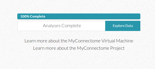
The interface is nice in keeping the user updated about an estimated time remaining. We accomplished this by running the analyses through completiion to come up with a set of initial times associated with the generation of each output file. Since these files are generated reliably in the same order, we could generate a function to return the time associated with the index of the output file farthest along in the list. This means that if there is an error and a file is not produced, the original estimated time may be off by some, but the total time remaining will be calculated based on files that do not exist after the index of the most recently generated file. This means that it can adjust properly in the case of files missing due to error. It’s a rather simple system that can be greatly improved upon, but it seemed to work.
Communication
As the user watches a percentile completed bar increase with an estimated time remaining, different links to analyses items change from gray to green to indicate completion. The user can also look at the log tab to see outputs to the console. We took care to arrange the different kinds of analyses in the order they are presented in the paper, but the user has no insight beyond that. An ideal reproducible workflow would give the user insight to what is actually happening, not just in an output log, but in a clean interface with descriptions and explanations of inputs and outputs. It might even include comments from the creator about parameters and analysis choices. How would this be possible? The software could read in comments from code, and the generator of the repo would be told to leave notes about what is going on in the comments. the software would need to then be able to track what lines are currently being executed in a script, and report comments appropriately. A good reprodudible workflow comes with ample, even excessive, documentation, and there is no doubt about why something is happening at any given point.
Template Interfaces
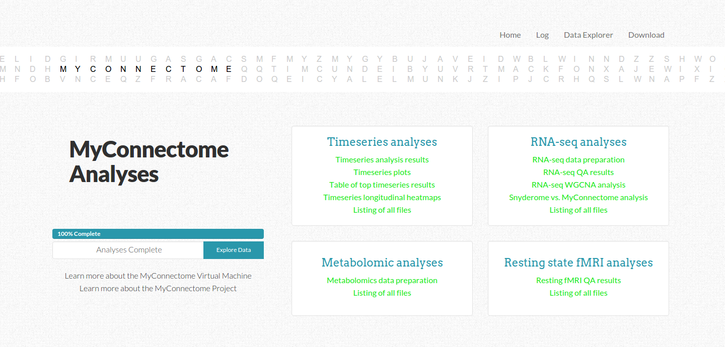
The front page is a navigation screen to link to all analyses, and it updates in real time to keep the user informed about what is completed. An interactive D3 banner across the top of the screen was the very first component I generated specifically for this interface, inspired by a static image on Russ’ original site. While custom, hard coded elements are sometimes appropriate, I much prefer to produce elements that can be customized for many different use cases. Although these elements serve no purpose other than to add a hint of creativity and fun, I think taking the time and attention for these kinds of details makes applications a little bit special, more enjoyable for the user, and thus more likely to be used.
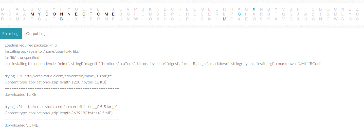
The output and error log page is a set of tabs that read in dynamically from an output text file. The funny thing about these logs is that what gets classified as “error” versus “output” is largely determined by the applications outputting the messages, and I’m not sure that I completely agree with all of these messages. I found myself needing to check both logs when searching for errors, and realizing that the developer can’t rely on the application classification to return reliable messages to the user. Some higher level entity would need to more properly catch errors and warnings, and present them in a more organized fashion than a simple dump of a text file on a screen. It’s not terrible because it worked well to debug the virtual machine during development, but it’s a bit messy.
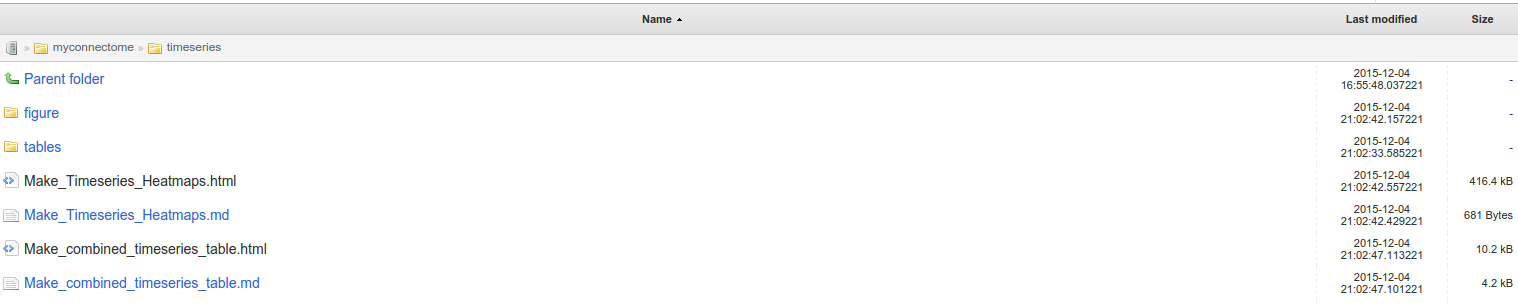
The interactive data tables page uses the Jquery Datatables library to make nicely paginated, sortable tables of results. I fell in love with these simple tables when I first laid eyes on them during my early days of developing for NeuroVault. When you don’t know any better, the idea of having a searchable, sortable, and dynamic table seems like magic. It still does. The nice thing about science is that regardless of the high-tech visualizations and output formats, many results are arguably still presented best in a tabular format. Sometimes all we really want to do is sort based on something like a p-value. However, not everything is fit for a table. I don’t think the researcher deploying the workflow should need to have to match his or her results to the right visualization type - the larger idea here is that outputs and vIsualization of some kind of result must be sensitive to output data type. Our implementation was largely hard coded for each individual output, whether that be an ipython notebook or R Markdown rendered to HTML, a graphic, PDF, or a table. Instead of this strategy, I can envision a tool that sees an “ipynb” and knows to install a server (or point a file to render at one) and if it sees a csv or tsv file, it knows to plug it into a web template with an interactive table. In this light, we can rank the “goodness” of a data structure based on how easy it is to convert from its raw output to something interpretable in a web browser. Something like a PDF, tsv, graphic, or JSON data structure get an A+. A brain image that needs a custom viewer or a data structure that must be queried (e.g., RDF or OWL) does not fare as well, but arguably the tool deploying the analysis can be sensitive to even complex data formats. Finally, all directories should be browsable, as we accomplished with Flask-Autoindex.
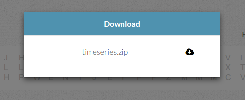
Download
On the simplest level, outputs should be easy to find, and viewable for inerpretation in some fashion. It also might make sense to provide zipped versions of data outputs for the user to quickly download from the virtual machine, in the case of wanting to do something on a local computer or share the data.
Usage and Reproducibility Metrics
As all good developers do, we copy pasted some Google Analytics code into our page templates so that we could keep track of visitors and usage. However, releasing a reproducible workflow of this type that is to be run on some system with a web connection offers so much more opportunity for learning about reproducible analyses. In the case that it’s not on a virtual machine (e.g., someone just ran the myconnectome python package on their computer) we could have a final step to upload a report of results to somewhere so that we could compare across platforms. We could track usage over time, and see if there are some variables we didn’t account for to lead to variance in our results. The entire base of “meta data about the analysis” is another thing all together that must be considered.
Next steps: the Reprodudible Repo
Throughout this process, the cognition that repeatedly danced across my mind was “How do I turn this into something that can be done with the click of a button?” Could this process somehow be automatized, and can I plug it into Github? I did a fun bit of work to make a small package called visci, and it’s really just a low level python module that provides a standard for plugging some set of outputs into some template that can be rendered via continuous integration (or other platform). This seems like one of the first problems to solve to make a more intelligent tool. We would want to be able to take any workflow, hand it over to some software that can watch it run, and then have that software plug the entire thing into a virtual machine that can immediately be deployed to reproduce the analyses. I have not yet ventured into playing more with this idea, but most definitely will in the future, and look forward to the day when its standard practice to provide workflows in immediately reproducible formats.
Suggested Citation:
Sochat, Vanessa. "Reproducible Analyses: the MyConnectome Project." @vsoch (blog), 09 Dec 2015, https://vsoch.github.io/2015/myconnectome/ (accessed 14 Jul 26).