Visualizing things is really challenging. The reason is because it’s relatively easy to make a visualization that is too complex for what it’s trying to show, and it’s much harder to make a visualization catered for a specific analysis problem. Simplicity is usually the best strategy, but while standard plots (e.g., scatter, box and whisker, histogram) are probably ideal for publications, they aren’t particularly fun to think about. You also have the limitations of your medium and where you paint the picture. For example, a standard web browser will get slow when you try to render ~3000 points with D3. In these cases you are either trying to render too many, or you need a different strategy (e.g., render points on canvas in favor of number over interactivity).
I recently embarked on a challenge to visualize a model defined at every voxel in the brain (a voxel is a little 3D cube of brain landscape associated with an X,Y,Z coordinate). Why would I want to do this? I won’t go into details here, but with such models you could predict what a statistical brain map might look like based on cognitive concepts, or predict a set of cognitive concepts from a brain map. This work is still being prepared for publication, but we needed a visualization because the diabolical Poldrack is giving a talk soon, and it would be nice to have some way to show output of the models we had been working on. TLDR: I made a few Flask applications and shoved them into Docker continers with all necessary data, and this post will review my thinking and design process. The visualizations are in no way “done” (whatever that means) because there are details and fixes remaining.
Step 1: How to cut the data
We have over 28K models, each built from a set of ~100 statistical brain maps (yes, tiny data) with 132 cognitive concepts from the Cognitive Atlas. When you think of the internet, it’s not such big data, but it’s still enough to make putting it in a single figure challenging. Master Poldrack had sent me a paper from the Gallant Lab, and directed me to Figure 2:

I had remembered this work from the HIVE at Stanford, and what I took away from it was the idea for the strategy. If we wanted to look at the entire model for a concept, that’s easy, look at the brain maps. If we want to understand all of those brain maps at one voxel, then the visualization needs to be voxel-specific. This is what I decided to do.
Step 2: Web framework
Python is awesome, and the trend for neuroimaging analysis tools is moving toward Python dominance. Thus, I decided to use a small web framework called Flask that makes data –> server –> web almost seamless. It takes a template approach, meaning that you write views for a python-based server to render, and they render using jinja2 templates. You can literally make a website in under 5 minutes.
Step 3: Data preparation
This turned out to be easy. I could generate either tab delimited or python pickled (think a compressed data object) files, and store them with the visualizations in their respective Github repos.
Regions from the AAL Atlas
At first, I generated views to render a specific voxel location, some number from 1..28K that corresponded with an X,Y,Z coordinate. The usability of this is terrible. Is someone really going to remember that voxel N corresponds to “somewhere in the right Amygdala?” Probably not. What I needed was a region lookup table. I wasn’t decided yet about how it would work, but I knew I needed to make it. First, let’s import some bread and butter functions!
import pandas
import nibabel
import requests
import xmltodict
from nilearn.image import resample_img
from nilearn.plotting import find_xyz_cut_coords
The requests library is important for getting anything from a URL into a python program. nilearn is a nice machine learning library for python (that I usually don’t use for machine learning at all, but rather the helper functions), and xmltodict will do exactly that, convert an xml file into a superior data format :). First, we are going to use the Neurovault RESTApi to both obtain a nice brain map, and the labels from it. In the script to run this particular python script, we have already downloaded the brain map itself, and now we are going to load it, resample to a 4mm voxel (to match the data in our model), and then associate a label with each voxel:
# OBTAIN AAL2 ATLAS FROM NEUROVAULT

data = nibabel.load("AAL2_2.nii.gz")
img4mm = nibabel.load("MNI152_T1_4mm_brain_mask.nii.gz")

# Use nilearn to resample - nearest neighbor interpolation to maintain atlas
aal4mm = resample_img(data,interpolation="nearest",target_affine=img4mm.get_affine())

# Get labels
labels = numpy.unique(aal4mm.get_data()).tolist()

# We don't want to keep 0 as a label
labels.sort()
labels.pop(0)

# OBTAIN LABEL DESCRIPTIONS WITH NEUROVAULT API
url = "http://neurovault.org/api/atlases/14255/?format=json"
response = requests.get(url).json()
We now have a json object with a nice path to the labels xml! Let’s get that file, convert it to a dictionary, and then parse away, Merrill.
# This is an xml file with label descriptions
xml = requests.get(response["label_description_file"])
doc = xmltodict.parse(xml.text)["atlas"]["data"]["label"]  # convert to a superior data structure :)
Pandas is a module that makes nice data frames. You can think of it like a numpy matrix, but with nice row and column labels, and functions to sort and find things.
# We will store region voxel value, name, and a center coordinate
regions = pandas.DataFrame(columns=["value","name","x","y","z"])

# Count is the row index, fill in data frame with region names and indices
count = 0
for region in doc:
    regions.loc[count,"value"] = int(region["index"])
    regions.loc[count,"name"] = region["name"]
    count+=1
I didn’t actually use this in the visualization, but I thought it might be useful to store a “representative” coordinate for each region:
# USE NILEARN TO FIND REGION COORDINATES (the center of the largest activation connected component)
for region in regions.iterrows():
    label = region[1]["value"]
    roi = numpy.zeros(aal4mm.shape)
    roi[aal4mm.get_data()==label] = 1
    nii = nibabel.Nifti1Image(roi,affine=aal4mm.get_affine())
    x,y,z = [int(x) for x in find_xyz_cut_coords(nii)]
    regions.loc[region[0],["x","y","z"]] = [x,y,z]
and then save the data to file, both the “representative” coords, and the entire aal atlas as a squashed vector, so we can easily associate the 28K voxel locations with regions.
# Save data to file for application
regions.to_csv("../data/aal_4mm_region_coords.tsv",sep="\t")

# We will also flatten the brain-masked imaging data into a vector,
# so we can select a region x,y,z based on the name
region_lookup = pandas.DataFrame(columns=["aal"])
region_lookup["aal"] = aal4mm.get_data()[img4mm.get_data()!=0]

region_lookup.to_pickle("../data/aal_4mm_region_lookup.pkl")
For this first visualization, that was all that was needed in the way of data prep. The rest of the files I already had on hand, nicely formatted, from the analysis code itself.
Step 4: First Attempt: Clustering
My first idea was to do a sort of “double clustering.” I scribbled the following into an email late one night:
…there are two things we want to show. 1) is relationships between concepts, specifically for that voxel. 2) is the relationship between different contrasts, and then how those contrasts are represented by the concepts. The first data that we have that is meaningful for the viewer are the tagged contrasts. For each contrast, we have two things: an actual voxel value from the map, and a similarity metric to all other contrasts (spatial and/or semantic). A simple visualization would produce some clustering to show to the viewer how the concepts are similar / different based on distance. The next data that we have “within” a voxel is information about concepts at that voxel (and this is where the model is integrated). Specifically - a vector of regression parameters for that single voxel. These regression parameter values are produced via the actual voxel values at the map (so we probably would not use both). What I think we want to do is have two clusterings - first cluster the concepts, and then within each concept bubble, show a smaller clustering of the images, clustered via similarity, and colored based on the actual value in the image (probably some shade of red or blue).
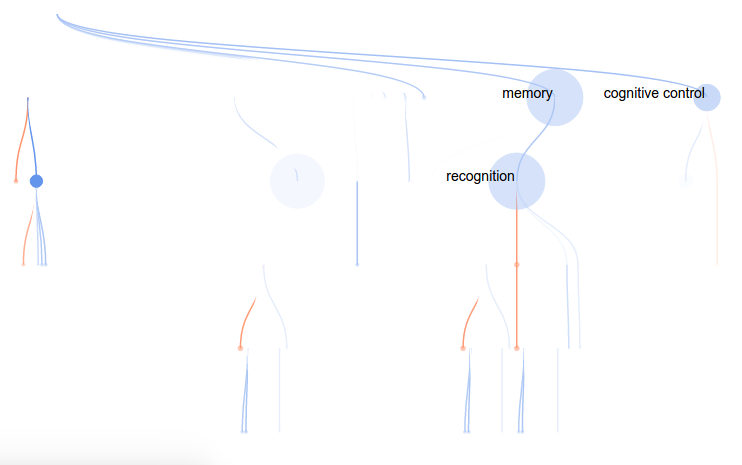
Yeah, please don’t read that. The summary is that I would show clusters of concepts, and within each concept cluster would be a cluster of images. Distance on the page, from left to right, would represent the contribution of the concept cluster to the model at the voxel. This turned out pretty cool:
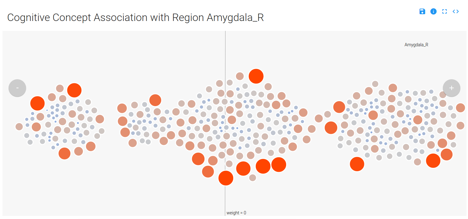
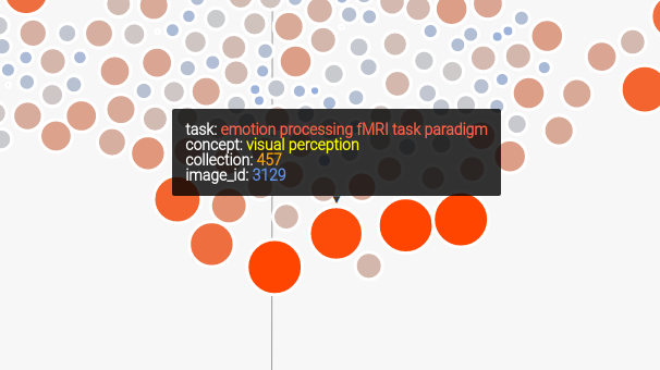
You can mouse over a node, which is a contrast image (a brain map) associated with a particular cognitive concept, and see details (done by way of tipsy). Only concepts that have a weight (weight –> importance in the model) that is not zero are displayed (and this reduces the complexity of the visualization quite a bit), and the nodes are colored and sized based on their value in the original brain map (red/big –> positive, and blue/small –> negative):
You can use the controls in the top right to expand the image, save as SVG, link to the code, or read about the application:
You can also select a region of choice from the dropdown menu, which uses select2 to complete your choice. At first I showed the user the voxel location I selected as “representative” for the region, but I soon realized that there were quite a few large regions in the AAL atlas, and that it would be incorrect and misleading to select a representative voxel. To embrace the variance within a region but still provide meaningful labels, I implemented it so that a user can select a region, and a random voxel from the region is selected:
    ...
    # Look up the value of the region
    value = app.regions.value[app.regions.name==name].tolist()[0]

    # Select a voxel coordinate at random
    voxel_idx = numpy.random.choice(app.region_lookup.index[app.region_lookup.aal == value],1)[0]

    return voxel(voxel_idx,name=name)
Typically, Flask view functions return… views :). In this case, the view returned is the original one that I wrote (the function is called voxel) to render a view based on a voxel id (from 1..28K). The user just sees a dropdown to select a region:

Finally, since there are multiple images tagged with the same concept in an image, you can mouse over a concept label to highlight those nodes in the image. You can also mouse over a concept label to highlight all the concepts associated with the image. We also obtain a sliced view of the image from NeuroVault to show to the user.
Step 5: Problems with First Attempt
I first thought it was a pretty OK job, until my extremely high-standard brain started to tell me how crappy it was. The first problem is that the same image is shown for every concept it’s relevant for, and that’s both redundant and confusing. It also makes no sense at all to be showing an entire brain map when the view is defined for just one voxel. What was I thinking?
The second problem is that the visualization isn’t intuitive. It’s a bunch of circles floating in space, and you have to read the “about” very careful to say “I think I sort of get it.” I tried to use meaningful things for color, size, and opacity, but it doesn’t give you really a sense of anything other than, maybe, magnetic balls floating in gray space.
I thought about this again. What a person really wants to know, quickly, are
1) which cognitive concepts are associated with the voxel?
2) How much?
3) How do the concepts relate in the ontology?
I knew very quickly that the biggest missing component was some representation of the ontology. How was “recognition” related to “memory” ? Who knows! Let’s go back to the drawing table, but first, we need to prepare some new data.
Step 6: Generating a Cognitive Atlas Tree
A while back I added some functions to pybraincompare to generate d3 trees from ontologies, or anything you could represent with triples. Let’s do that with the concepts in our visualization to make a simple json structure that has nodes with children.
from pybraincompare.ontology.tree import named_ontology_tree_from_tsv
from cognitiveatlas.datastructure import concept_node_triples
import pickle
import pandas
import re
First we will read in our images, and we only need to do this to get the image contrast labels (a contrast is a particular combination / subtraction of conditions in a task, like “looking at pictures of cats minus baseline”).
# Read in images metadata
images = pandas.read_csv("../data/contrast_defined_images_filtered.tsv",sep="\t",index_col="image_id")
The first thing we are going to do is generate a “triples data structure,” a simple format I came up with that would be simple for pybraincompare to understand that would allow it to render any kind of graph into the tree. It looks like this:
## STEP 1: GENERATE TRIPLES DATA STRUCTURE

'''
  id    parent  name
  1 none BASE                   # there is always a base node
  2 1   MEMORY                  # high level concept groups
  3 1   PERCEPTION
  4 2   WORKING MEMORY          # concepts
  5 2   LONG TERM MEMORY
  6 4   image1.nii.gz           # associated images (discovered by way of contrasts)
  7 4   image2.nii.gz
'''
Each node has an id, a parent, and a name. For the next step, I found the unique contrasts represented in the data (we have more than one image for contrasts), and then made a lookup to find sets of images based on the contrast.
# We need a dictionary to look up image lists by contrast ids
unique_contrasts = images.cognitive_contrast_cogatlas_id.unique().tolist()

# Images that do not match the correct identifier will not be used (eg, "Other")
expression = re.compile("cnt_*")
unique_contrasts = [u for u in unique_contrasts if expression.match(u)]

image_lookup = dict()
for u in unique_contrasts:
   image_lookup[u] = images.index[images.cognitive_contrast_cogatlas_id==u].tolist()
To make the table I showed above, I had added a function to the Cognitive Atlas API python wrapper called concept_node_triples.
output_triples_file = "../data/concepts.tsv"

# Create a data structure of tasks and contrasts for our analysis
relationship_table = concept_node_triples(image_dict=image_lookup,output_file=output_triples_file)
The function includes the contrast images themselves as nodes, so let’s remove them from the data frame before we generate and save the JSON object that will render into a tree:
# We don't want to keep the images on the tree
keep_nodes = [x for x in relationship_table.id.tolist() if not re.search("node_",x)]
relationship_table = relationship_table[relationship_table.id.isin(keep_nodes)]

tree = named_ontology_tree_from_tsv(relationship_table,output_json=None)
pickle.dump(tree,open("../data/concepts.pkl","w"))
json.dump(tree,open("../static/concepts.json",'w'))
Boum! Ok, now back to the visualization!
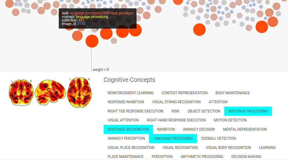
Step 7: Second Attempt: Tree
For this attempt, I wanted to render a concept tree in the browser, with each node in the tree corresponding to a cognitive concept, and colored by the “importance” (weight) in the model. As before, red would indicate positive weight, and blue negative (this is a standard in brain imaging, by the way). To highlight the concepts that are relevant for the particular voxel model, I decided to make the weaker nodes more transparent, and nodes with no contribution (weight = 0) completely invisible. However, I would maintain the tree structure to give the viewer a sense of distance in the ontology (distance –> similarity). This tree would also solve the problem of understanding relationships between concepts. They are connected!
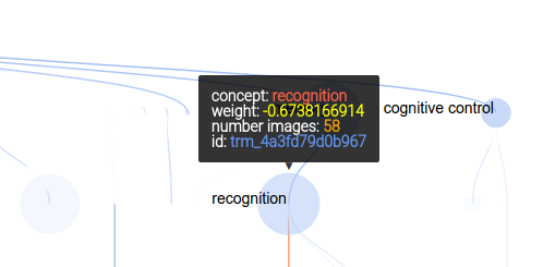
As before, mousing over a node provides more information:
and the controls are updated slightly to include a “find in page” button:

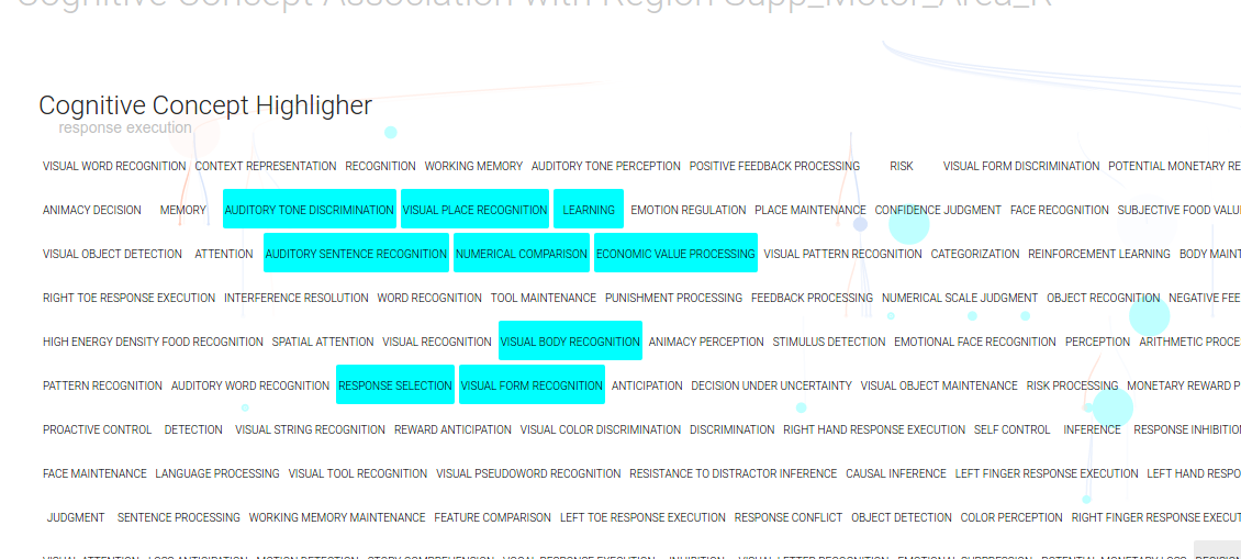
Which, when you click on it, brings up an overlay where you can select any cogntiive concepts of your choice with clicks, and they will light up on the tree!
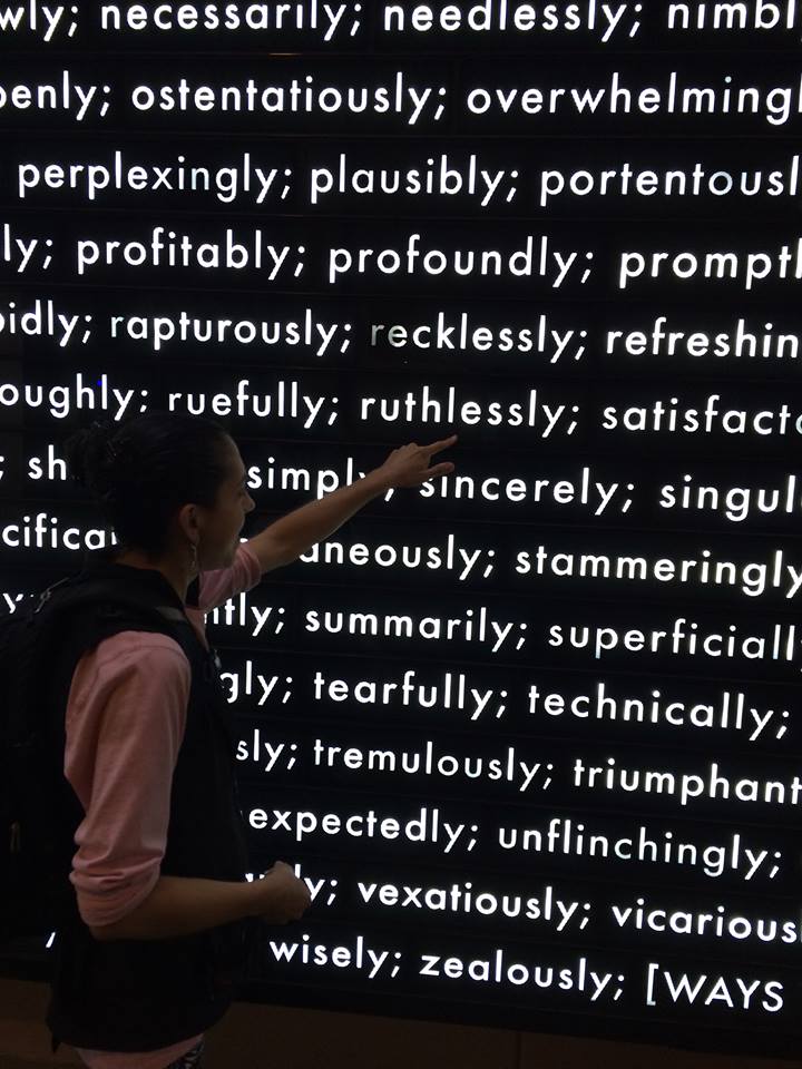
If you want to know the inspiration for this view, it’s a beautiful installation at the Stanford Business School that I’m very fond of:
The labels were troublesome, because if I rendered too many it was cluttered and unreadable, and if I rendered too few it wasn’t easy to see what you were looking at without mousing over things. I found a rough function that helped a bit, but my quick fix was to simply limit the labels shown based on the number of images (count) and the regression parameter weight:
    // Add concept labels
    var labels = node.append("text")
        .attr("dx", function (d) { return d.children ? -2 : 2; })
        .attr("dy", 0)
        .classed("concept-label",true)
        .style("font","14px sans-serif")
        .style("text-anchor", function (d) { return d.children ? "end" : "start"; })
        .html(function(d) {
            // Only show label for larger nodes with regression parameter >= +/- 0.5
            if ((counts[d.nid]>=15) && (Math.abs(regparams[d.nid])>=0.5)) {
                return d.name
            }
        });
Step 8: Make it reproducible
You can clone the repo on your local machine and run the visualization with native Flask:
    git clone https://github.com/vsoch/cogatvoxel
    cd cogatvoxel
    python index.py
Notice anything missing? Yeah, how about installing dependencies, and what if the version of python you are running isn’t the one I developed it in? Eww. The easy answer is to Dockerize! It was relatively easy to do, I would use docker-compose to grab an nginx (web server) image, and my image vanessa/cogatvoxeltree built on Docker Hub. The Docker Hub image is built from the Dockerfile in the repo, which installs dependencies, maps the code to a folder in the container called /code and then exposes port 8000 for Flask:
FROM python:2.7
ENV PYTHONUNBUFFERED 1
RUN apt-get update && apt-get install -y \
    libopenblas-dev \
    gfortran \
    libhdf5-dev \
    libgeos-dev

MAINTAINER Vanessa Sochat

RUN pip install --upgrade pip
RUN pip install flask
RUN pip install numpy
RUN pip install gunicorn
RUN pip install pandas

ADD . /code
WORKDIR /code

EXPOSE 8000
Then the docker-compose file uses this image, along with the nginx web server (this is pronounced “engine-x” and I’ll admit it took me probably 5 years to figure that out).
web:
  image: vanessa/cogatvoxeltree
  restart: always
  expose:
    - "8000"
  volumes:
    - /code/static
  command: /usr/local/bin/gunicorn -w 2 -b :8000 index:app

nginx:
  image: nginx
  restart: always
  ports:
    - "80:80"
  volumes:
    - /www/static
  volumes_from:
    - web
  links:
    - web:web
It’s probably redundant to again expose port 8000 in my application (the top one called “web”), and add /www/static to the web server static. To make things easy, I decided to use gunicorn to manage serving the application. There are many ways to skin a cat, there are ways to run a web server… I hope you choose web servers over skinning cats.
That’s about it. It’s a set of simple Flask applications to render data into a visualization, and it’s containerized. To be honest, I think the first is a lot cooler, but the second is on its way to a better visualization for the problem at hand. There is still a list of things that need fixing and tweaking (for example, not giving the user control over the threshold for showing the node and links is not ok), but I’m much happier with this second go. On that note, I’ll send a cry for reproducibility out to all possible renderings of data in a browser…
Visualizations, contain yourselves!
Suggested Citation:
Sochat, Vanessa. "Visualizations, Contain yourselves!." @vsoch (blog), 10 Apr 2016, https://vsoch.github.io/2016/contained-visualizations/ (accessed 14 Jul 26).