This post has three parts. In the first I’ll talk about challenges in data science and rationale for an initiative I’ve started called the Dinosaur Datasets. Discussion of this initiative is the second part. In the third part I’ll walk through an early analysis for one of these datasets that aims to start work to answer questions about organizing and understanding scientific software.
Data Analysis, Starting Simple
Data science isn’t something you learn in an online quick-and-dirty bootcamp, although many times the internet might tell you otherwise. As I’ve grown from a graduate student into a software engineer, I’ve watched the “current trendy term” that describes almost the same thing morph over time. Are any of these words familiar?
big data
data mining
statistical learning
computer vision
machine intelligence
machine learning
deep learning
artificial intelligence / AI
robots!!
People seem to have thoughtful discussion about how they are very different, and the differences are tied to different job titles. I understand this because there is a human need to identify with the title that you are given. But when I really think about all of these roles that revolve around “I am discovering or developing using data” I see a core set of tools (or perhaps starting points) that then branch out into various areas of expertise. The areas of expertise are also almost endless and constantly changing so it’s unlikely that any one person can really be trained to know it all.
What is troubling?
For the purpose of this thinking, let’s dump everyone into the same bucket that starts working with some dataset, and call them “data scientists.” The best data scientists, in my opinion, approach a new problem with creativity, and a desire to explore. You can’t make assumptions about the distribution or temporal features of the data because, well, they would just be assumptions. The observation that I find troubling is this transition:
[ trendy thing ] --> [ need for thing ] --> [ more jobs ] --> [ quick and dirty courses ]
                                                              [ plug and play functions ]
An Example: Widgets!
Here’s an example. I work for a company that makes widgets. I read an article on some online magazine that “everyone in Silicon Valley is using this thing”, so I want to as well. I then create a job for a person to do the thing, but oh no! There aren’t enough people with the skillset to hire from. The salaries go up because everyone is competing for the same small set of people, and people notice this. The demand for the education and training resources goes up, and society responds by creating these resources. This culminates in many resources that look like this:
- Load this library in [insert scientific programming language here]
- Run a line to magically procure data
- Run one or two more lines to test, train, and build a model
Data Scientist Robots
The issue I have with the above is that it trains an army of people that are optimized to do everything with the same tools, and in (very similar) ways. We place a lot of trust in the developers of the libraries to do it best, and maybe in some cases this is OK, but there is a huge lost opportunity because you start with someone else’s bias. I get frustrated sometimes seeing all these “one line to test, trained classifier and you’re done!” tutorials on the internet. Why? Mostly because I don’t like black boxes. When I started learning methods for machine learning, my graduate program had us implement them from scratch. It was hard, and my scripts were way too long (I was pretty new to programming in Python, etc.) but it was satisfying because for the small number of methods that I implemented, I really understood what was going on. After the fact I feel okay about using (some) plug and play functions because I (sort of) have a feeling for the underlying algorithms.
The problem now is that we have all these “learn data science!” courses that jump over the details and just give you the one liner. There also is this trend that I see of “big data or the highway” and nobody talks about the fact that it’s still very hard to get good data. There is still value in small data. To shove some data matrix into a one line function without further ado is like choosing the destination over the journey, and what if there is a beautiful forest path that you missed entirely because you were following someone else’s map?
Let’s Count!
It would be inefficient to reinvent the wheel every time when you have a new dataset and want to analyze it. I’m not going to write another function for cross validation or to create an ROC curve when there are oodles. On the other hand, it borders on irresponsible to approach a dataset that you don’t understand and not do some basic poking at it first. There is a transition point somewhere between “I know nothing” and “I have an assertion to make” where you’ve just poked enough to be able to decide on some reasonable approaches. The risk in not doing some poking is that you miss some insight that might have led to an interesting and creative approach, one that moves away from the standard “plug it into tensorflow, keras, caffe, and give me all the GPUs” because that’s what everyone is doing and that is what the data scientist robot does.
Well, I’m a terrible data scientist
This post is about how I’m a terrible data scientist, because I run those one liners and am frustrated that someone has made the decisions for me, and it’s a black box.
But I really did try. For full disclosure, I actually did start with attempting a one liner. I wanted to jump right in and “use deep learning to classify images based on extension.” I started by attempting to split my data into test and training, but quickly realized that I would run out of memory to just try and load everything. This is a pretty common problem, and it meant that I would need to do some kind of “feed and train” strategy. But then I faced another problem! I didn’t know, a priori, the number or names of unique extensions and this would be essential to assemble my vector of train and test labels as I go. I then had a dinosaur epiphany that I was breaking my cardinal rule of doing data science. I needed to start simple. In my own defense, I haven’t done it for quite some time given my work with software engineering / containers. I stepped back. My new set of goals, discussed in this post, were to:
- create a dictionary to lookup counts for extensions
- plot/visualize the counts to understand the distributions
- assemble a set of reasonable extensions to work with
I didn’t have many expectations beyond expecting that there would be MANY file “extensions” that aren’t even extensions, and a subset of files without extensions (e.g., README) that would also
be meaningful to classify. I wasn’t sure if the practice would be useful, but minimally I wanted
to assemble a set of extensions that I thought were reasonable to work with.
With this simple goal, let’s continue with this post! This post is about counting things, and it’s an example of how simple (and some would consider stupid) methods are important and (I believe) valuable. Yes, many posts would skip over counting things, but I can spend an entire day looking at just that (and in fact I just spent TWO days) and feel like I’ve learned something, and have some direction and more interesting questions to ask. Let’s go!
Dinosaur Datasets
I’ve started a small Dinosaur Datasets initiative where my plan is to make high quality, creative datasets (and examples using them) available for use to the larger open source community.
Why?
Creative Datasets May not Be Produced or Shared
I’ve always liked the idea of finding data in surprising places. Think about the impact that some datasets (e.g., this one have had on development of methods or learning, but at face value they don’t answer any “burning scientific questions.” These weird and creative datasets are hard to find. If a researcher creates one, it would mean putting a lot of effort into structuring and sharing, which is still not a direct path to a scientific career. The Dinosaur Datasets will attempt to generate and share creative datasets with no expectations other than to help learn, encourage open source data sharing, and empower others to discover knowledge in interesting places. I also want to inspire work that might show (on the institution level) that development of infrastructure and provisioning of data for widespread use is a better model for discovery. For example, a graduate student can start with “here is an API to get cool data” instead of “here is a set of links on the internet where you could download stuff 10 years ago and do the same preprocessing that 2,000 others have already done and not shared, godspeed.”
I want to answer questions about software
Part of this is selfish. The kind of questions that I’m interested in answering are not related to things that directly link to a product or something that would benefit a company or sound sexy in a paper. I’m interested in the design of software, and if we can identify signatures of quality or even scientific domains. Why? Because we are starting to package software with entire operating systems in containers, and finding 1,500 containers all called “tensorflow” isn’t terribly meaningful to me. I’ve gone on about the importance of comparing containers, and many of my containertools and a scattered publication hint on the need for this. It’s still an unsolved problem, and although it’s likely that some big company will swoop in and save the day, I strongly believe the single person can still have impact. As I started on a new effort to create data structures and tools for my own analysis, I realized that we would go a lot farther, faster, if we worked together. So TLDR, as I investigate these questions, I’m going to share my work to prepare data and use it with you. I want you to be just as empowered as me to try answering some of these questions, and I don’t want you to have to redo work if it’s not needed.
Zenodo Machine Learning (ML)
When I was a graduate student I tried parsing Pubmed Central for Github repo addresses, and then making a graph of related content. It was a massive failure that mostly frustrated my lab later in taking up a bunch of unnecessary space on Sherlock (sorry guys!). I also had a second (mostly failed) effort by extracting counts of extensions for containers on Singularity Hub, which I’m pretty sure nobody cared or knew existed. For this third go around, I wanted a better source of data. I wanted to have confident pairings of code, intended for science, with rich metadata. The answer, of course, was a service that I really like called Zenodo. If you aren’t familiar, it’s a place to get a digital object identiifer (DOI) for your digital resource (code! Github!) that others can then cite. This first dinosaur dataset, called Zenodo ML, in a nutshell is sets of 80x80 images and metadata derived from just under 10K software repositories on Github. If you use this dataset in your work, please cite the Zenodo DOI:
What can we do with Zenodo records?
My goal is to identify signatures of files that identify different software, and then groupings of software that are indicative of a domain or method in a container. Once we can do this, it will be much more reasonable to try and organize the universe of containers. Zenodo is the perfect repository to start exploring this problem, because the records can be filtered to software, and the software comes with rich metadata and an archive of the code. In this post we won’t even get into machine learning or the metadata, we are just going to look at some of the code. For more details and the scripts that I will describe, you can read more about the dataset here.
Let’s count things!
The Data
What is the data format?
For each zenodo record, we have two Python pickles in a folder, one that contains images, and the other that contains metadata. The folders are organized based on zenodo identifier, and all things are compressed into a squashfs filesystem so that you can mount it for use. If we do this reproducibily, you would care about the version of python used to save (and thus load) the pickles, and would load with a container. I’m going to skip over this detail for this writeup, because it’s more discussed at the Dinosaur Datasets page.
What does the data look like?
Metadata
Here is an example of the metadata for a record, after being loaded from a pickle. It’s a json object!
pickle.load(open(metadata_pkl,'rb'))

{'hit': {'conceptdoi': '10.5281/zenodo.999908',
  'conceptrecid': '999908',
  'created': '2017-09-30T16:51:17.219991+00:00',
  'doi': '10.5281/zenodo.999909',
  'files': [{'bucket': '06a4915a-1cb2-4026-b32a-6a4a01b416d0',
    'checksum': 'md5:eed2b4ea7fca4367982fc3e73f4b8e25',
    'key': 'eas342/added_idl_scripts-v1.0.zip',
    'links': {'self': 'https://zenodo.org/api/files/06a4915a-1cb2-4026-b3...,
    'size': 299200,
    'type': 'zip'}],
  'id': 999909,
  'links': {'badge': 'https://zenodo.org/badge/doi/10.5281/zenodo.999909.svg',
   'bucket': 'https://zenodo.org/api/files/06a4915a-1cb2-4026-b32a-6a4a01b416d0',
   'conceptbadge': 'https://zenodo.org/badge/doi/10.5281/zenodo.999908.svg',
   'conceptdoi': 'https://doi.org/10.5281/zenodo.999908',
   'doi': 'https://doi.org/10.5281/zenodo.999909',
   'html': 'https://zenodo.org/record/999909',
   'latest': 'https://zenodo.org/api/records/999909',
   'latest_html': 'https://zenodo.org/record/999909',
   'self': 'https://zenodo.org/api/records/999909'},
  'metadata': {'access_right': 'open',
   'access_right_category': 'success',
   'creators': [{'name': 'eas342'}],
   'description': '<p>This has the scripts used in the spectra variability ...,
   'doi': '10.5281/zenodo.999909',
   'license': {'id': 'other-open'},
   'publication_date': '2017-09-30',
   'related_identifiers': [{'identifier': 'https://github.com/eas342/added_idl_scripts/tree/v1.0',
     'relation': 'isSupplementTo',
     'scheme': 'url'},
    {'identifier': '10.5281/zenodo.999908',
     'relation': 'isPartOf',
     'scheme': 'doi'}],
   'relations': {'version': [{'count': 1,
      'index': 0,
      'is_last': True,
      'last_child': {'pid_type': 'recid', 'pid_value': '999909'},
      'parent': {'pid_type': 'recid', 'pid_value': '999908'}}]},
   'resource_type': {'title': 'Software', 'type': 'software'},
   'title': 'eas342/added_idl_scripts: Scripts for Spectral Pipeline in BD Variability paper.'},
  'owners': [36643],
  'revision': 2,
  'updated': '2017-09-30T16:52:08.570885+00:00'},
 'tree': ContainerTree<55>}
It’s highly informative because it comes with publications, people, keywords, and other interesting tidbits. It’s no surprise, this is standard output from the Zenodo API. The additions that I’ve added are the ContainerTree object (Trie), which I discuss here. Here is looking at a tree for the same repository above:
meta=pickle.load(open(metadata_pkl,'rb'))
meta.keys()
# dict_keys(['tree', 'hit'])

meta['tree']
ContainerTree<55>

meta['tree'].root.children[0].children

Out[84]:
[Node<README.md>,
 Node<al_legend.pro>,
 Node<assert.pro>,
 Node<bjd2utc.pro>,
 Node<blockify.pro>,
 Node<cggreek.pro>,
...
 Node<tai_utc.pro>,
 Node<threshold.pro>,
 Node<tnmin.pro>,
 Node<utc2bjd.pro>,
 Node<markwardt>]
There are many more questions that might be answered by this data that I haven’t even touched on!
Images
The images are also provided in a pickle, and within the pickle you will find lists of 80x80
samples in dictionaries indexed by the file name. To make it easy for you (and me) to use, I’ve
provided functions that load the data in various ways. Here is an example of (raw)
images loaded, using the function load_all
load_all(image_pkl)

array([[[  59.,   43.,   32., ...,   32.,   32.,   32.],
        [  59.,   32.,   78., ...,   32.,   32.,   32.],
        [  59.,   32.,   32., ...,   32.,   32.,   32.],
        ...,
        [  59.,   32.,   32., ...,   32.,   32.,   32.],
        [  59.,   32.,   32., ...,  107.,   44.,   32.],
        [  59.,   32.,   32., ...,   32.,   32.,   32.]],

       [[  59.,   32.,   32., ...,   32.,   32.,   32.],
        [  59.,   32.,   32., ...,   32.,   32.,   32.],
        [  59.,   32.,   32., ...,   32.,   32.,   32.],
        ...,

load_all(image_pkl).shape
(138, 80, 80) #(-- 138 80x80 images (code samples) that make up this entire repository
You can also load based on a regular expression (to get samples from a subset of files matching it):
load_all(image_pkl, regexp='a')
From load_all we don’t get a sense of what we are loading, it’s just dumping everything
from a repository into one data frame. If we want to organize by extensions, we can do that too:
load_by_extension(image_pkl)
{'pro': array([[[  59.,   43.,   32., ...,   32.,   32.,   32.],
         [  59.,   32.,   78., ...,   32.,   32.,   32.],
         [  59.,   32.,   32., ...,   32.,   32.,   32.],
         ...,
         [  59.,   32.,   32., ...,   32.,   32.,   32.],
         [  59.,   32.,   32., ...,  107.,   44.,   32.],
         [  59.,   32.,   32., ...,   32.,   32.,   32.]],

        [[  59.,   32.,   32., ...,   32.,   32.,   32.],
         [  59.,   32.,   32., ...,   32.,   32.,   32.],
         [  59.,   32.,   32., ...,   32.,   32.,   32.],
...
The loaded data above tells us that the above repository has extension “pro” for some of its files. See for yourself!
Why are there images?
This is what I think is cool for this dataset. It’s pretty standard for someone to think “oh, text, let’s use NLP methods with text processing of course!” I think there is meaningful context for code not just between words in the same line, but also between lines, and so I wanted to create a dataset that would plug into image processing methods. Thus I have converted the text characters into ordinal values and we are going to do image processing! To show you directly what I mean here, take a look at this image. Can you tell what kind of file it is?

What about this one?

The top is a “.c” file, and the bottom is an “.h” file (the header for it). Off the bat, isn’t it pretty crazy cool that we see differences at all? Why has nobody looked at this? Also from matrix and following images above, can you guess what 32 is? it’s a space, of course. Likely this data could be compressed further by taking this into account - the 32 is akin to a 0 in a sparse matrix.
What about breaking an image into samples?
When we look at a particular script broken into a set of images (for example, one file might be broken into N=4 80x80 images), if we count the images in this manner, this gives greater weight to files that are longer. It might not be fair to do this kind of count given the case that some languages are more verbose (require more lines). However, I made this decision to count the number of samples because I’m interested in the overall amount/prevalence. One python file that is much longer than a second python file should represent a higher prevalence of Python for the repository. To make better comparisons between Python and R, for example, we would need to compare samples of code for each language that “are optimized” to do the same thing. This is something I’d like to do, but for a different project. For now, it is my choice for counts to reflect general proposition of code in a repository, not just counts of the files themselves. If you do an analysis with the data, you could choose to do this differently.
Now let’s answer some really simple questions.
How is code broken down by extension?
Background
A script, or any script, that isn’t binary is essentially a text file. If we had a massive folder of randomly named files, it would be hard to tell off the bat what they did:
run_analysis
noodles1
noodles2
check_analysis
readme
If you were to execute any of the above like this:
# Make sure it's executable
$ chmod u+x run_analysis.sh

# Execute!
$ ./run_analysis
You might be okay if the first line of the script indicates the interpreter to use:
#!/usr/bin/env python
But for the human making the call, we don’t learn much unless the output of our call gives some hint to the language. For this reason we have file extensions. Does this look better?
run_analysis.py
noodles.h
noodles.c
check_analysis.sh
readme.md
For the execution of scripts, your computer largely doesn’t care if you are great with file extensions, although your text editors might be. Thankfully us humans do care and we create all these little extension guys to help.
Analysis
Thus, for our first analysis we are going to look at file extensions, and I hinted at this above by showing you a “.c” vs “.h” file. A file extension is a very simple way to indicate the kind of code that lives in a repository. For full disclosure, I had originally wanted to just plot counts for all of the extensions represented, but the total unique “extensions” was almost 20K. Immediately this told me a few things:
- It could be that many extensions are output/log files, e.g., result.sub1
- Maybe there are more languages (and extensions) than I ever imagined!
- Some repos might be acting more as databases with weird extensions, and not just code
I realized that (at least to start) I needed to identify the subset that was important to me. I decided that I cared about the top set of possibly 50 to 100, and not the many extensions with a small number of files. First, I needed to verify this was indeed the case. I wrote functions to look at distributions after filtering out extensions with counts less than some value:
def filter_by_value(d, value=100, plot=True):
    filtered = {k:v for k,v in d.items() if v > value}
    print('Original extension counts filtered from %s down to %s' %(len(d),
                                                                    len(filtered)))
    return filtered


def filter_and_plot(d, value=100):
    filtered = filter_by_value(d, value=value)
    plt.hist(list(filtered.values()), bins=10)
    plt.title("Proportion of Code by Extension Type, > %s samples" %value)
    plt.show()
    return filtered
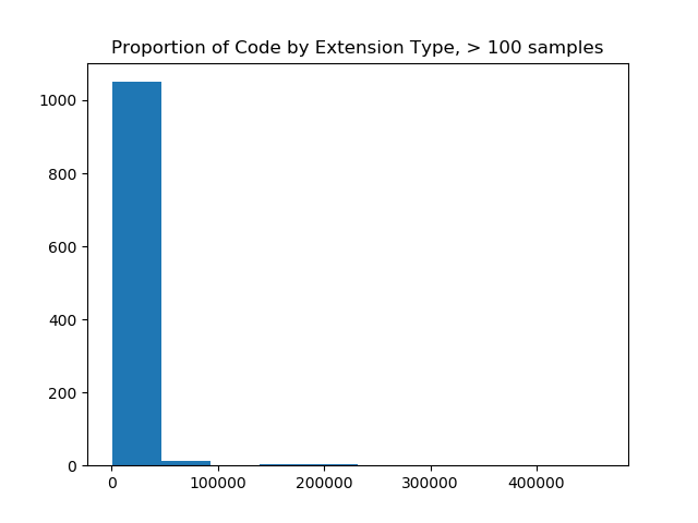
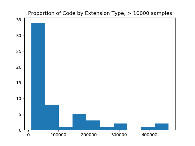
And first I tried looking at those with counts > 100 (still too many) and then 10,000 (just right!).
filter_and_plot(ext_counts)
# Original extension counts filtered from 19926 down to 1077

filtered = filter_and_plot(ext_counts, value=10000)
# Original extension counts filtered from 19926 down to 57
The image on the left made me realize that I needed to filter more aggressively, and and the image on the right (with a filter value of 10K) was most reasonable for a bar chart, as it would show counts of code samples for 57 extensions. The image on the right also shows us that the maximum number of samples for an extension is over 400,000, and that most of the upper range of counts (~33 extensions) fall between having 0 and 100K samples. When we do this, we are left with 57 extensions! This is a scale I was hoping for!
Why are there so many rare extensions?
The fact that there are SO many files with “niche extensions” tells me two things. For the niche extensions as a result of “niche languages,” we probably can say this is meaningful and reflects less popular languages or data format files. For the niche extensions that people just make up, well this teaches us that people don’t understand the purpose of file extensions :) I suppose they are meaningful to them? To each his own!
What are the top 57 extensions then?
Now that we’ve cut the data to a reasonable working size, let’s look at the actual extensions! First we need a function to sort a dictionary, so the plot can be sorted.
def sort_dict(d, reverse=True):
    return [(k,v) for v,k in sorted([(v,k) for k,v in d.items()],reverse=reverse)]
Then plot that stuff!
sorted_counts = sort_dict(filtered)
x,y = zip(*sorted_counts)

# Plot the result
pos = numpy.arange(len(x))
plt.bar(pos,y,color='g',align='center')

ax = plt.axes()
ax.set_xticks(pos)
ax.set_xticklabels(x)

# Rotate
for tick in ax.get_xticklabels():
    tick.set_rotation(90)

# Finishing up Counting - visualize counts and discuss!

plt.title("Top %s extensions, ordered by total samples across ~10K repositories." %len(x))
plt.show()
Result
Here we see the top 57 extensions across 10K Github repos from Zenodo, where the count indicates the number of code samples for the extension in the repo. Holy crap! Can we talk about this?
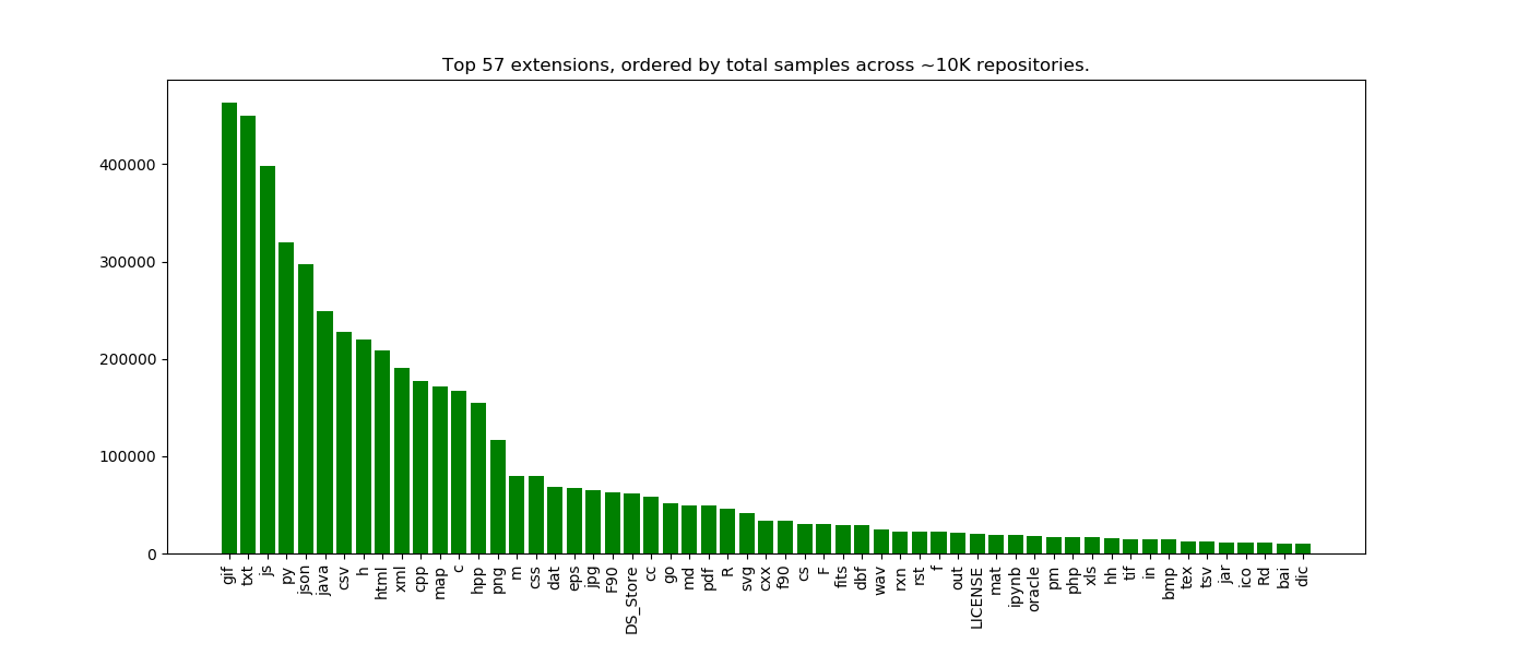
This is what I find so exciting about starting simple. I had so many questions and observations just looking at this plot, and here I will share some early thinking.
The counts suggest scientific code / data repositories
These are definitely somewhat scientific code repositories, because we see csv and json in the top results. Sure, they could be csv/json for some generic data too, but my sense is that if you find a data file under version control, there is some component of a data analysis involved. I’d want to ask what kind of person that isn’t doing data analysis would have incentive to put files of this type under version control??
The second hint is that the fourth top language is Python. We don’t see R until waaay down in the list. I think this likely reflects the fact that, despite what the internet says, Python is a lot more utilized for other things (web applications, etc.). whereas R is a very niche data science programming language that just touches into webby things with Shiny. That said, both languages are heavily used and valuable, and (I think) will continue to grow in popularity. Is there a way we could possible untangle these two things, to look at Python for data science vs. Python for web applications? Likely yes, if we look at co-occurrence of extensions within a repository. Note that I didn’t do this for this post, but it’s on my todo list!
Counting might be a reasonable way to reflect language popularity
Many of the posts that I’ve read that try to guess “What is the most popular programming language” are based on surveys or similar. This is actually okay because many of the surveys ask a yuuuge number of developers, but I’ll point out that this answer is coming from the code directly. We are, however, biased to a see a set of scripts in repos that programmers have decided to submit to Zenodo, period. It could be that many data scientists in private companies, or ones that care less (or don’t know) about creating DOIs are completely missing from this sample. My point is that my choice of using Zenodo, period, is biasing the result. We make observations based on this limited dataset, and it’s just one way to assess language popularity.
What is going on with gif?
I am really surprised that “.gif” is the top file extension, and this needs a lot more investigation because it’s probably a bug in how we are counting samples. I had thought about nixing “true” images (e.g., gif, png, bmp, etc.) from the analysis, but didn’t think that would be fair to do, but now I realize I probably need to. If it were truly the case that gifs are very prevalent, from this I would guess there are sites that host gif that are using Github to store their data, or that some set of scientific software outputs results in gif. We would need to look more closely at the repositories to assess this. This observation should be taken with a lot of skepticism and desire for more exploration.
Things that shouldn’t be there…
OHMYGOSH don’t even get me started about the “DS_STORE”. It means that people are doing this:
git add *
And now files that are totally unrelated to the software are stored in the repositories. Unfortunately, this is a signal that could help someone looking for “unintended files added” (you know, all those files with your tokens / secrets / passwords that you should not add) to easily find. The presence of a DS_STORE is a signature for “I added things irresponsibly, oups.”
Expected proportions
I am happy to see that “c” and “h” files both appeared in the top, and in almost equal proportions. This also makes sense. Java is also another leader, although not as high up as Python :)
The documentation is strong!
I am also happy to see a high prevalence of markdown (.md) and LICENSE files, and maybe a bit disappointed that README didn’t make the top. Is it the case that README is in there, but not properly counted because of differences in extension? Possibly, for example, we could have had README.md, README.txt, and README (without extension) and the first two would be reflected in “.txt” and “.md.” Actually, let’s take a look at this. I wrote another function to use a regular expression to group all different kinds of README/LICENSE, and I also added in a check to look for container recipes (why not!). Here are the final counts:
{'docker': 473,
 'license': 31038,
 'readme': 42330,
 'singularity': 47}
And from this, we can calculate an average per repository.
# How many on average *samples* per repo?
for kind,c in counts.items():
    avg = c / count
    print('Average of %s of type %s' %(avg,kind))

# Average of 4.390168014934661 of type readme
# Average of 0.04905621240406555 of type docker
# Average of 0.004874507363617507 of type singularity
# Average of 3.2190416925948973 of type license
I looked at this result and of course it seemed off, because remember that this is reflective of the number of samples, and doesn’t say that there are N number of actual files. It says that we on average have about 4x80 lines for readme files, and 3 by 80 lines for LICENSE files. The READMEs could either be more prevalent or just overall longer, or some combination of those two varying between repos. I’m too lazy right now to rewrite the function, but you get the deal :)
Next Steps!
We haven’t even delved into the questions that we can answer, I literally spent a few days counting things. My goal was to derive a set of reasonable extensions to work with, and I have a set that I’m happy with, and I know I need to assess if images should be included or not (probably not). What is troubling is that small journeys like this to understand data are sometimes (maybe many times) not reflected in a final publication. Maybe there would be one line, something like:
To select the top extensions to assess, we filtered to those with greater than 10,000 samples across all repositories.
Are we happy that is enough to carry forward to future readers? Are we able to reproduce from that? Do we learn much? I’m not sure, but it doesn’t feel substantial enough to reflect the journey and fun I’ve had counting things. This is just more evidence that our traditional way of publishing needes to move more toward something that looks like a version controlled repository and away from a pdf with a maximum word count that is behind a paywall anyway.
Let’s work together!
If you want to work together on an analysis, I am always looking for friends and hope that you reach out. If you want to work with the data on your own, here are some questions to inspire and please cite the dataset (on Zenodo!) if you use it in your work.
These are things I want to see.
I’ll finish up with the change that I want to see. It’s much larger than me.
- I want institutions to value software engineers and compute to help researchers.
- I want funding bodies to do the same.
- I want researchers to produce and share high quality datasets.
- I want institutions to help researchers produce and share these datasets.
And these are some interesting datasets that I have in the queue!
- Dockerfiles
- California flowers
- Container Trees
I think we can accomplish these goals, but it will take time, not being afraid to ask for help, or reaching out to someone that you might not know to work together.
Suggested Citation:
Sochat, Vanessa. "Dinosaur Data Science, Start with Counting." @vsoch (blog), 09 Jun 2018, https://vsoch.github.io/2018/extension-counts/ (accessed 14 Jul 26).